Social Map
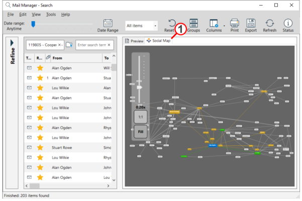
As an alternative to viewing the results in a list view the Social Map will display the results graphically showing the different relationships:
After using the query tools to narrow your search results select the Social Map tab in the preview pane. The map will update to suit changes made to your query.

Note:
· The larger the contact the more messages have been "Sent To" or "Received By" that contact.
· Moving the mouse over a contact will indicate the flow of the messages from and to the contact.
· The different colours mean:
Blue: contact in question (under cursor)
Orange: contacts that Blue has sent emails to, plus the link arrows
Green: contacts that Blue has received emails from, plus the link arrows
If there has been two-way traffic then you get both colour arrows
· Zoom in and out by holding down the Ctrl key and rolling the mouse wheel or using the slider.
· Pan by holding down the left-click mouse button